Easy Ways to Design Tech Logo for the Technological Company
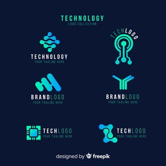
If you own a technological company, you’ll need to create a logo that appeals to your target market.
The technology business is flourishing, and tech companies now need to stand out from the throng more than ever. A compelling tech logo is a way to speak if you want to convey to your audience that your service and product are the best for the customers.
A great logo will help you deliver a confident message to the individuals you want to impress, whether you’re raising your first round of investments or are well past the startup phase. Let’s have a look at some of the most well-known tech logos for some ideas. When you’re ready to get started, scroll down for design best practices.
Design A Tech Logo That Last Forever in The Technological Industry
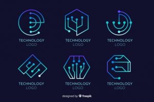
Do you need a modern and innovative tech logo for your side hustle venture or small tech business? DesignHours is a world-class logo designing agency that has created remarkable 2D/3D logo designs for all industry niches; while focusing on the principles of custom logo design, we always tend to create original, unique, and quality designs. Our tech logo designing process includes:
- Enter your company name and tagline (if applicable) and click design to create your tech logo in under two minutes.
- Let us know about your tech company, choose a logotype, and pick your favorite fonts so we can design the perfect logo for you!
- Use our logo expert’s opinion to make modifications and tweaks to bring your concept to life.
Choose The Right Icon
Simple, abstract symbols are frequently used in the best tech logos to communicate notions like forward-thinking and advancement. However, you might wish to utilize a symbol that describes the items or services you provide to your users. Technology is a large sector with many different niches to pick from. Consider the category in which your company falls and the themes that are associated with that category.
Consider how a drawing of your part would look if it were placed on a motherboard — perhaps there are wires connecting different nodes. That’s it, a sign that properly encapsulates what you do.
Another option is to select an icon that is a literal depiction of your company name. This is simple and clear, ensuring that your name and brand are easily recognizable whether a user sees your emblem or your name. If your company provides location services, try utilizing an icon that conveys that information simply by looking at it. Consider Google Maps’ pin-drop feature or Waze’s cartoon automobile character.
You can now take a more abstract approach and select a symbol that will make you stand out. It doesn’t need to be about anything specific; it just takes on a shape. Choose something distinctive that will be bold yet basic enough to be remembered, whether you want to emphasize the continuity element with a circle icon or something more structured with a rectangle. You’ll be fine as long as anything you choose indicates your brand in some way — feel, color, accurate portrayal, etc.
Choose The Best Colors
Your color palette is where you can most easily set yourself out from the competition. Whereas your main competitor is likely to utilize blues or blacks, you could wish to employ more brilliant colors that communicate directly to your target demographic. Consider whether or not your tech firm will have a presence in the app market. If it will, then picking a hue with a strong visual impact is crucial. Regardless of which platform you’re using, having a nice tech logo color combination is crucial, so choose something that will stand out.
You will need to think about the type of emotion you want your company to elicit, as this will influence the colors you choose.
The tech world is divided into two camps: startups and established tech firms when it comes to formality. Startups are usually more relaxed, while established tech firms are more rigorous and professional. What you pick will be determined by the impression you want to make on potential consumers and investors. Consider how you want to see if you provide a delivery service. Do you want to be laid-back and approachable, or do you want to be the greatest in your industry and project a sense of trustworthiness? Any color you choose will convey a different message to your service’s users.

Choose The Perfect Fonts
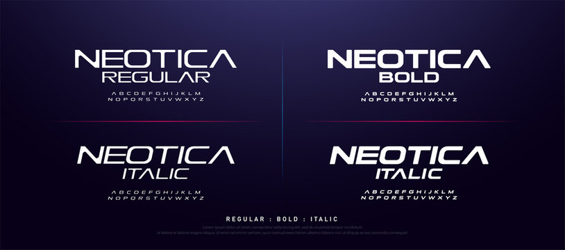
Because minimalism is the name of the game in the IT logo world, conventional serifs predominate. On the other hand, custom-made fonts with personality will appeal to organizations seeking a more current design. Make sure your tech logo is readable, regardless of the typeface you use.
It’s been said ago, and we’ll say it again: keep your logo design to a maximum of three fonts, ideally two. Any more than that, and it starts to seem a little disorganized. Consider this: your brand name will be written in the first font, and your tagline will be written in the second font.
Choose a sans-serif font if you want your font to have a more modern feel. This font is similar to Tahoma or Arial, but without the hats at the ends of the letters. This can be a terrific alternative if your tech company’s name is an acronym or has initials.
With all of these parts in place, you’ll need to decide how you want it to look when it’s finished.
Choose The Right Layout
Where will you spend most of your time branding? You’ll want to make sure your logo appears excellent on social media and other digital platforms if you’re a tech company. As a result, look for a logo layout that scales nicely so you may use it on business cards and swag. Proportion is crucial. Consider how each element in your logo design contributes to the overall design and scale it correctly. When scaling your logo, keep the ratio in mind. You can also decide to use your icon on lower scales and a combination of your icon and text on larger ones, such as printed materials.
Conclusion
The most crucial feature of a good plan is proportion, although density should also be considered. You don’t want your logo to appear crowded or as though each piece is unrelated to the others. Give your tech logo design a sense of balance so that the first thing people see isn’t chaos. Allow it to speak for itself in a straightforward yet powerful manner.
Customers will be the first to see and engage with your branding. Change the placement of your icon and text to play around with the look and feel, and most importantly, think about how your logo will be perceived.
Why DesignHours?
As digital marketing professionals, DesignHours helps architects, thinkers, and artists approach their jobs with the utmost clarity and creativity by breaking down the overall project into smaller, digestible portions. We guarantee the best quality designs that are unique and creative and if you need a little guidance, turn to the global community of designers at DesignHours.


